 Buy now
Cards: Advanced
Advanced use cases of card component.
Finder component
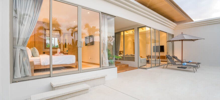
Property card: Vertical
import PropertyCard from '../components/PropertyCard'

{/* Vertical property card example (default) */}
<PropertyCard
  href='#'
  images={[
    ['/images/real-estate/catalog/04.jpg', 306, 200, 'Image'],
    ['/images/real-estate/catalog/03.jpg', 306, 200, 'Image'],
    ['/images/real-estate/catalog/05.jpg', 306, 200, 'Image']
  ]}
  title='3-bed Apartment | 67 sq.m'
  category='For sale'
  location='140-60 Beech Ave Flushing, NY 11355'
  price='$65,000'
  badges={[
    ['success', 'Verified'],
    ['info', 'New']
  ]}
  wishlistButton={{
    tooltip: 'Add to Wishlist',
    props: {
      onClick: () => alert('Property added to your Wishlist!')
    }
  }}
  footer={[
    ['fi-bed', 3],
    ['fi-bath', 1],
    ['fi-car', 2]
  ]}
  // light // Optionally pass light prop so the card works well on dark backgrounds
  className='mx-auto'
  style={{maxWidth: '306px'}}
/>
Property card: Horizontal
import PropertyCard from '../components/PropertyCard'

{/* Horizontal property card example (default) */}
<PropertyCard
  href='#'
  images={[
    ['/images/real-estate/catalog/09.jpg', 'Image'],
    ['/images/real-estate/catalog/13.jpg', 'Image'],
  ]}
  title='Terra Nova Apartments | 85 sq.m'
  category='For rent'
  location='21 India St Brooklyn, NY 11222'
  price='$2,400'
  badges={[
    ['success', 'Verified'],
    ['danger', 'Featured']
  ]}
  wishlistButton={{
    tooltip: 'Add to Wishlist',
    props: {
      onClick: () => alert('Property added to your Wishlist!')
    }
  }}
  footer={[
    ['fi-bed', 5],
    ['fi-bath', 2],
    ['fi-car', 2]
  ]}
  horizontal
  // light // Optionally pass light prop so the card works well on dark backgrounds
  style={{maxWidth: '55rem'}}
/>
Property card with content overlay
import PropertyCardOverlay from '../components/PropertyCardOverlay'

{/* Property card with content overlay example */}
<PropertyCardOverlay
  img={{
    src: '/images/real-estate/recent/02.jpg',
    alt: 'Background image'
  }}
  href='#'
  title='Duplex with Garage'
  category='For sale'
  location='21 Pulaski Road Kings Park, NY 11754'
  overlay
  badges={[
    ['info', 'New']
  ]}
  button={{
    href: '#',
    title: '$200,410',
    variant: 'primary',
    props: {
      onClick: () => alert('Another action via onClick prop')
    },
    wishlistProps: {
      onClick: () => alert('You've added Duplex with Garage property to your wishlist!')
    }
  }}
/>
Venue card

import VenueCard from '../components/VenueCard'

{/* Venue card example */}
<VenueCard
  href='#'
  img={{
    src: '/images/city-guide/catalog/02.jpg',
    width: 430,
    height: 196,
    alt: 'Image'
  }}
  title='Big Tree Cottage'
  rating={{
    value: '4.8',
    count: '24'
  }}
  price='$$$'
  location='0.5 km from center'
  wishlistButton={{
    tooltip: 'Add to Wishlist',
    props: {
      onClick: () => alert('Venue added to your Wishlist!')
    }
  }}
  // light // Optionally pass light prop so the card works well on dark backgrounds
  className='mx-auto'
  style={{maxWidth: '430px'}}
/>
Venue card with content overlay

import VenueCardOverlay from '../components/VenueCardOverlay'

{/* Venue card with content overlay example */}
<VenueCardOverlay
  img={{
    src: '/images/city-guide/home/upcoming-1.jpg',
    alt: 'Background image'
  }}
  title='Simon Rock Concert'
  date='Nov 15'
  time='21:00'
  // overlay // Optional overlay prop to add contrast to the content against background image
  button={{
    href: '#',
    title: 'Tickets from $50',
    variant: 'primary rounded-pill',
    props: {
      onClick: () => alert('You've just bought tickets to Simon Rock Concert.')
    },
    wishlistProps: {
      onClick: () => alert('You've added Simon Rock Concert event to your wishlist!')
    }
  }}
/>
Vehicle card: Vertical


import VehicleCard from '../components/VehicleCard'

{/* Vertical vehicle card (default) example */}
<VehicleCard
  href='#'
  images={[
    ['/images/car-finder/catalog/01.jpg', 400, 205, 'Image']
    // Add more images to the array to display a carousel
  ]}
  title='Ford Truck Lifted'
  year='1995'
  price='$24,000'
  location='Chicago'
  checkbox={{
    label: 'Compare',
    props: {
      onChange: (e) => e.target.checked ? alert('Car ADDED to comparison list!') : alert('Car REMOVED from comparison list!')
    }
  }}
  badges={[
    ['info', 'New']
  ]}
  wishlistButton={{
    tooltip: 'Add to Wishlist',
    props: {
      onClick: () => alert('Vehicle added to your Wishlist!')
    }
  }}
  footer={[
    ['fi-dashboard', '278K mi'],
    ['fi-gearbox', 'Manual'],
    ['fi-petrol', 'Diesel']
  ]}
  // light // Optionally pass light prop so the card works well on dark backgrounds
  className='mx-auto'
  style={{maxWidth: '400px'}}
/>
Vehicle card: Horizontal
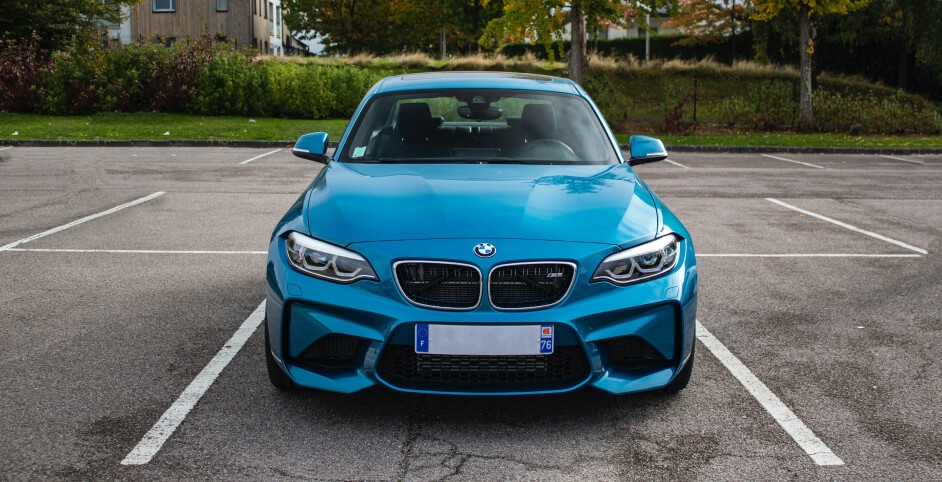
import VehicleCard from '../components/VehicleCard'

{/* Horizontal vehicle card (default) example */}
<VehicleCard
  href='#'
  images={[
    ['/images/car-finder/catalog/05.jpg', 'Image']
    // Add more images to the array to display a carousel
  ]}
  title='BMW 640 XI Gran Turismo'
  year='2018'
  price='$43,920'
  location='New Jersey'
  checkbox={{
    label: 'Compare',
    props: {
      onChange: (e) => e.target.checked ? alert('Car ADDED to comparison list!') : alert('Car REMOVED from comparison list!')
    }
  }}
  badges={[
    ['success', 'Certified']
  ]}
  wishlistButton={{
    tooltip: 'Add to Wishlist',
    props: {
      onClick: () => alert('Vehicle added to your Wishlist!')
    }
  }}
  footer={[
    ['fi-dashboard', '10K mi'],
    ['fi-gearbox', 'Automatic'],
    ['fi-petrol', 'Gasoline']
  ]}
  horizontal
  // light // Optionally pass light prop so the card works well on dark backgrounds
  style={{maxWidth: '55rem'}}
/>
Job card
 IT Pro TVFeatured
Business Analyst
IT Pro TVFeaturedBusiness Analyst
import JobCard from '../components/JobCard'

{/* Job card example */}
<JobCard
  href='#'
  company={{
    name: 'IT Pro TV',
    logo: {
      src: '/images/job-board/company/it-pro.png',
      size: [24, 24]
    }
  }}
  title='Business Analyst'
  location='New York'
  salary='$7,500'
  badges={[
    ['accent', 'Featured']
  ]}
  dropdown={[
    {
      // href: '#', // Optionally pass href prop to convert dropdown item to Next link
      icon: 'fi-heart',
      label: 'Add to wishlist',
      props: {
        onClick: () => alert('Added to your wishlist!')
      }
    },
    {
      // href: '#', // Optionally pass href prop to convert dropdown item to Next link
      icon: 'fi-x-circle',
      label: 'Not interested',
      props: {
        onClick: () => alert('Vacancy will no longer be shown to you!')
      }
    },
  ]}
  wishlistButton={{
    tooltip: 'Add to Saved jobs',
    props: {
      onClick: () => alert('Job saved to your list!')
    }
  }}
  // light // Optionally pass light prop so the card works well on dark backgrounds
  style={{maxWidth: '32rem'}}
/>
Resume card

Graphic DesignerVerified
New York
$2,000 - $2,500
Graphic DesignerVerified
New York
$2,000 - $2,500
import ResumeCard from '../components/ResumeCard'

{/* Resume card example */}
<ResumeCard
  href='#'
  img={{
    src: '/images/avatars/37.png',
    alt: 'Applicant name'
  }}
  title='Graphic Designer'
  location='New York'
  salary='$2,000 - $2,500'
  badges={[
    ['success', 'Verified']
  ]}
  dropdown={[
    {
      icon: 'fi-heart',
      label: 'Add to wishlist',
      props: {
        onClick: () => alert('Added to your wishlist!')
      }
    },
    {
      icon: 'fi-x-circle',
      label: 'Not interested',
      props: {
        onClick: () => alert('Resume will no longer be shown to you!')
      }
    },
  ]}
  // light // Optionally pass light prop so the card works well on dark backgrounds
  style={{maxWidth: '42rem'}}
/>
Blog card: Simple


import BlogCard from '../components/BlogCard'

{/* Simple blog card example */}
<BlogCard
  href='#'
  img={{
    src: '/images/car-finder/blog/06.jpg',
    size: [416, 200],
    alt: 'Image'
  }}
  category={{
    href: '#',
    title: 'Test Drives'
  }}
  title='This Year is All About New Harley Davidson'
  author={{
    href: '#',
    img: '/images/avatars/12.jpg',
    name: 'Cody Fisher'
  }}
  date='Nov 24'
  comments='3 comments'
  // light // Optionally pass light prop so the card works well on dark backgrounds
  className='mx-auto'
  style={{maxWidth: '416px'}}
/>
Blog card: Vertical


Tips & Advice
How to Win Your First Job In Tech
Nunc, hac augue ante in facilisi id. Consectetur egestas orci, arcu ac tellus...

Annette Black
Dec 182 comments
Tips & Advice
How to Win Your First Job In Tech
Nunc, hac augue ante in facilisi id. Consectetur egestas orci, arcu ac tellus...
Annette Black
Dec 182 comments
import BlogCard from '../components/BlogCard'

{/* Vertical blog card example */}
<BlogCard
  type='card'
  href='#'
  img={{
    src: '/images/job-board/blog/12.jpg',
    size: [748, 520],
    alt: 'Image'
  }}
  category={{
    href: '#',
    title: 'Tips & Advice'
  }}
  title='How to Win Your First Job In Tech'
  text='Nunc, hac augue ante in facilisi id. Consectetur egestas orci, arcu ac tellus...'
  author={{
    href: '#',
    img: '/images/avatars/18.png',
    name: 'Annette Black'
  }}
  date='Dec 18'
  comments='2 comments'
  // light // Optionally pass light prop so the card works well on dark backgrounds
  className='mx-auto'
  style={{maxWidth: '374px'}}
/>
Blog card: Horizontal

Inspiration
10 Ways to Stay Ahead of the Curve
Ac sit tincidunt lacus dignissim volutpat dui scelerisque porttitor non. Elit at ullamcorper feugiat porta adipiscing...

Kristin Watson
Dec 231 comment
Inspiration
10 Ways to Stay Ahead of the Curve
Ac sit tincidunt lacus dignissim volutpat dui scelerisque porttitor non. Elit at ullamcorper feugiat porta adipiscing...
Kristin Watson
Dec 231 comment
import BlogCard from '../components/BlogCard'

{/* Horizontal blog card example */}
<BlogCard
  type='card-horizontal'
  href='#'
  img={{
    src: '/images/job-board/blog/06.jpg',
    alt: 'Image'
  }}
  category={{
    href: '#',
    title: 'Inspiration'
  }}
  title='10 Ways to Stay Ahead of the Curve'
  text='Ac sit tincidunt lacus dignissim volutpat dui scelerisque porttitor non. Elit at ullamcorper feugiat porta adipiscing...'
  author={{
    href: '#',
    img: '/images/avatars/21.png',
    name: 'Kristin Watson'
  }}
  date='Dec 23'
  comments='1 comment'
  // light // Optionally pass light prop so the card works well on dark backgrounds
  style={{maxWidth: '856px'}}
/>
Content overlay on hover


import Link from 'next/link'
import Card from 'react-bootstrap/Card'
import ProgressBar from 'react-bootstrap/ProgressBar'
import CardImageHoverOverlay from '../components/CardImageHoverOverlay'

{/* Card extra content overlay on hover example */}

{/* Default variant */}
<Card as={Link} href='#' className='card-hover shadow-sm border-0' style={{maxWidth: '306px'}}>
  <CardImageHoverOverlay
    img={{
      src: '/images/real-estate/city/chicago.jpg',
      size: [306, 236],
      alt: 'Chicago'
    }}
  >
    <div className='mb-2'>
      <h4 className='fs-xs fw-normal text-light mb-2'>
        <i className='fi-wallet fs-sm align-middle mt-n1 me-2'></i>
        Property for sale
      </h4>
      <div className='d-flex align-items-center'>
        <ProgressBar variant='danger' now={37} className='progress-light w-100' />
        <span className='text-light fs-sm ps-1 ms-2'>268</span>
      </div>
    </div>
    <div className='pt-1'>
      <h4 className='fs-xs fw-normal text-light mb-2'>
        <i className='fi-home fs-sm align-middle mt-n1 me-2'></i>
        Property for rent
      </h4>
      <div className='d-flex align-items-center'>
        <ProgressBar variant='success' now={80} className='progress-light w-100' />
        <span className='text-light fs-sm ps-1 ms-2'>1540</span>
      </div>
    </div>
  </CardImageHoverOverlay>
  <Card.Body className='text-center'>
    <Card.Title as='h3' className='fs-base text-nav mb-0'>Chicago</Card.Title>
  </Card.Body>
</Card>

{/* Light variant to display aginst dark backgrounds */}
<Card as={Link} href='#' className='card-hover card-light mx-auto' style={{maxWidth: '306px'}}>
  <CardImageHoverOverlay
    img={{
      src: '/images/real-estate/city/chicago.jpg',
      size: [306, 236],
      alt: 'Chicago'
    }}
    light
  >
    <div className='mb-2'>
      <h4 className='fs-xs fw-normal text-light mb-2'>
        <i className='fi-wallet fs-sm align-middle mt-n1 me-2'></i>
        Property for sale
      </h4>
      <div className='d-flex align-items-center'>
        <ProgressBar variant='danger' now={37} className='progress-light w-100' />
        <span className='text-light fs-sm ps-1 ms-2'>268</span>
      </div>
    </div>
    <div className='pt-1'>
      <h4 className='fs-xs fw-normal text-light mb-2'>
        <i className='fi-home fs-sm align-middle mt-n1 me-2'></i>
        Property for rent
      </h4>
      <div className='d-flex align-items-center'>
        <ProgressBar variant='success' now={80} className='progress-light w-100' />
        <span className='text-light fs-sm ps-1 ms-2'>1540</span>
      </div>
    </div>
  </CardImageHoverOverlay>
  <Card.Body className='text-center'>
    <Card.Title as='h3' className='fs-base text-light opacity-80 mb-0'>Chicago</Card.Title>
  </Card.Body>
</Card>
Account card with navigation

import { useState } from 'react'
import Link from 'next/link'
import Avatar from '../components/Avatar'
import StarRating from '../components/StarRating'
import CardNav from '../components/CardNav'
import Button from 'react-bootstrap/Button'
import Collapse from 'react-bootstrap/Collapse'

{/* State to control Collapse */}
const [open, setOpen] = useState(false)

{/* Account card with navigation example */}

{/* Default variant */}
<div className='card card-body border-0 shadow-sm pb-1'>
  <div className='d-flex d-md-block d-lg-flex align-items-start mb-4'>
    <Avatar img={{ src: '/images/avatars/01.jpg', alt: 'Robert Fox' }} size={[48, 48]} />
    <div className='pt-md-2 pt-lg-0 ps-3 ps-md-0 ps-lg-3'>
      <h2 className='fs-lg mb-0'>Robert Fox</h2>
      <StarRating rating={4.8} />
      <ul className='list-unstyled fs-sm mt-3 mb-0'>
        <li>
          <a href='tel:3025550107' className='nav-link fw-normal p-0'>
            <i className='fi-phone opacity-60 me-2'></i>
            (405) 732-9046
          </a>
        </li>
        <li>
          <a href='mailto:annette_black@email.com' className='nav-link fw-normal p-0'>
            <i className='fi-mail opacity-60 me-2'></i>
            robert_fox@email.com
          </a>
        </li>
      </ul>
    </div>
  </div>
  <Button as={Link} href='#' size='lg' className='w-100 mb-3'>
    <i className='fi-plus me-2'></i>
    Sell car
  </Button>
  <Button
    variant='outline-secondary'
    className='d-block d-md-none w-100 mb-3'
    onClick={() => setOpen(!open)}
    aria-controls='account-menu'
    aria-expanded={open}
  >
    <i className='fi-align-justify me-2'></i>
    Menu
  </Button>
  <Collapse in={open} className='d-md-block'>
    <div id='account-menu'>
    <CardNav className='pt-3'>
      <CardNav.Item href='#' icon='fi-user opacity-60'>Personal Info</CardNav.Item>
      <CardNav.Item href='#' icon='fi-car opacity-60' active>My Cars</CardNav.Item>
      <CardNav.Item href='#' icon='fi-heart opacity-60'>Wishlist</CardNav.Item>
      <CardNav.Item href='#' icon='fi-star opacity-60'>Reviews</CardNav.Item>
      <CardNav.Item href='#' icon='fi-bell opacity-60'>Notifications</CardNav.Item>
      <CardNav.Item href='#' icon='fi-logout opacity-60'>Sign Out</CardNav.Item>
    </CardNav>
    </div>
  </Collapse>
</div>


{/* Light variant to display aginst dark backgrounds */}
<div className='card card-body card-light border-0 shadow-sm pb-1'>
  <div className='d-flex d-md-block d-lg-flex align-items-start mb-4'>
    <Avatar img={{ src: '/images/avatars/01.jpg', alt: 'Robert Fox' }} size={[48, 48]} />
    <div className='pt-md-2 pt-lg-0 ps-3 ps-md-0 ps-lg-3'>
      <h2 className='text-light fs-lg mb-0'>Robert Fox</h2>
      <StarRating rating={4.8} light />
      <ul className='list-unstyled fs-sm mt-3 mb-0'>
        <li>
          <a href='tel:4057329046' className='nav-link-light fw-normal p-0'>
            <i className='fi-phone opacity-75 me-2'></i>
            (405) 732-9046
          </a>
        </li>
        <li>
          <a href='mailto:robert_fox@email.com' className='nav-link-light fw-normal p-0'>
            <i className='fi-mail opacity-75 me-2'></i>
            robert_fox@email.com
          </a>
        </li>
      </ul>
    </div>
  </div>
  <Button as={Link} href='#' size='lg' className='w-100 mb-3'>
    <i className='fi-plus me-2'></i>
    Sell car
  </Button>
  <Button
    variant='outline-light'
    className='d-block d-md-none w-100 mb-3'
    onClick={() => setOpen(!open)}
    aria-controls='account-menu'
    aria-expanded={open}
  >
    <i className='fi-align-justify me-2'></i>
    Menu
  </Button>
  <Collapse in={open} className='d-md-block'>
    <div id='account-menu'>
    <CardNav className='pt-3'>
      <CardNav.Item href='#' icon='fi-user'>Personal Info</CardNav.Item>
      <CardNav.Item href='#' icon='fi-car' active>My Cars</CardNav.Item>
      <CardNav.Item href='#' icon='fi-heart'>Wishlist</CardNav.Item>
      <CardNav.Item href='#' icon='fi-star'>Reviews</CardNav.Item>
      <CardNav.Item href='#' icon='fi-bell'>Notifications</CardNav.Item>
      <CardNav.Item href='#' icon='fi-logout'>Sign Out</CardNav.Item>
    </CardNav>
    </div>
  </Collapse>
</div>