
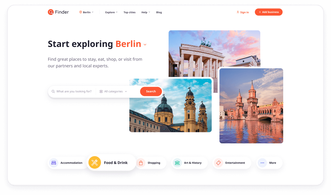
Find your ideal


Finder feature highlights


Powered by React / Next.js
Finder is powered by React and Next.js framework. It supports hybrid static & server-side rendering, route pre-fetching, image optimization and more.

Built with Bootstrap 5
Finder is the powerful front-end solution based on Bootstrap 5 — the world’s most popular responsive, mobile-first component library.

Easy to customize with Sass
Finder is built using Sass. Easily change colors, typography and much more. It is the most mature, stable, and powerful CSS extension language in the world.

50+ flexible components
Besides styling all default Bootstrap 5 components Finder introduces lots of new flexible, customizable and reusable elements you can use across the website.

Kick-start your development
Start your development process fast and easy with Node.js Create Next App setup. Configuration files are included in download package. Full tasks automation.

Mobile friendly interface
It's not a surprise that nowadays over 60% of users surf the inernet using their mobile devices. Finder is 100% responsive and optimized for small touch screens.

Vector based HD ready icons
Finder is equiped with font-based icon pack to ensure that infographics and interface icons look sharp on any device with any screen resolution and pixel density.

Google fonts
Finder uses Google font (Noto Sans) which is free, fast to load and of very high quality. Currently Google fonts library includes 1000+ font families to choose from.

Detailed documentation
Download package includes offline and links to online documentation. It covers all important information about how to get started, customize template and components usage.